2013 Promises to Bring More Color to Your World—Even Within Neutrals
Think about the box of crayons you had when you were a child. It contained the primary shades, like blue, green, red and yellow, and possibly a few unexpected hues, like apricot, brick red and turquoise. Now think about the crayons today’s kids carry to school. Forks Township, Pa.-based Crayola LLC currently offers 133 standard crayon colors. One box may contain several blues, including cerulean, cyan, denim, indigo, pacific and sky. Could you explain the slight variations between these shades of blue? Probably not. But there are color experts among us who are delighted by the opportunities this recent color explosion presents to the field of interior design.
“Anyone who’s designing with colors is absolutely thrilled because people call and ask what colors they can do in their spaces now,” explains Mark Woodman, owner of mark woodman design + color, a consulting firm. “They may not necessarily be comfortable enough to make the decisions when it comes to adding color, and it can be daunting; an error of color in a space can put you off for a really long time, but the right color is perfection.”
Woodman also acts as president of Alexandria, Va.-based Color Marketing Group, an international association whose mission is to create color forecast information for professionals who design and market color. In addition, he is the North American representative for London-based Global Color Research, a firm that works internationally with companies that incorporate color trends into their products and services to increase customer appeal and satisfaction. Woodman’s profession allows him to travel the world to learn about the latest trends and consult about color. Based on his insights, the trendy hues of 2013 and beyond are sure to inspire.

Color Rules
Woodman says global trends have greatly influenced color in America, making our choices much broader than ever before. “In 2012, there was hardly a color you couldn’t get and it was one season after another,” Woodman says. “Some may argue we’ve always had color but it has not been the breadth we saw in 2012, and I think it’s going to continue.”
Despite our ability to bring more color into our lives than ever before, many Americans still fear bold colors in their spaces. Corporate or commercial buildings tend to rely on a neutral palette for public spaces and allow tenants to bring more of their own identities or branded colors onto their floors. An easy way to add pops of color in neutral public spaces is through accessories and artwork. “I was in Miami recently and walked by an office building that was all white, but someone had collected blue and white Chinese Canton ware and made it the color theme throughout,” Woodman recalls. “Blue in Miami is really cooling.” He adds texture also can add interest to a neutral space.
Color rules, such as blue providing a cooling ambiance in a hot city like Miami, still ring true and should be taken into consideration when choosing color schemes within a space. To put it simply, cool colors are blues, greens and purples, and warm colors are oranges, reds and yellows.
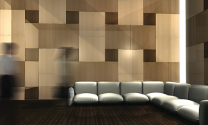
panels that can be mixed and matched, or use them to accent spaces. PHOTO: Marlite
Woodman, however, relies more on color “temperature” rather than the hue itself when choosing colors. For example, fast-food chains use very bright red on hard surfaces. “Red is a very aggressive color; it’s also an appetite stimulant,” Woodman says. “If you put an aggressive color on a hard surface, people will get in, get their food, eat their food and get out. If you darken the red to a burgundy and put it on a soft fabric you’ve given it deeper value so it’s more welcoming and slows customers down. The classic color for a fine restaurant has always been a burgundy color. The red inherently is exactly the same but two different outcomes come from it.”


